


001! Making the Myth: Behind the Scenes of an Album Campaign

Hi!
Thanks for locking in for the first edition of Sound + Vision. It’s been a while since I’ve dared to put any writing (with a byline) out into the world. I wrote a small intro on who I am in the About section, so if you’d like to read some background, be my guest.
I’m starting this newsletter to explore ideas and share thoughts, and hopefully inspire conversation too. The music industry can be an opaque hellscape, and frankly I miss the days of blogging where a bunch of nerds who just love music wrote about it with no intention other than sharing. That was me, and it still is me, but this time I’ve since been in the trenches working on music projects and have some actual insights.
I’m going to be talking mostly about music and visual culture in its many forms, the ways in which music makes its way into the world and how the business side interacts with the creative side.
For this first one, I want to share some thoughts on image-making in music, and how I’ve approached this in my own work. It’s a deep dive into the mechanics of an album campaign, and is adapted from a guest lecture I gave to graphic design students at Maryland Institute College of Art in 2021. I promise they won’t all be this long!
"Why was packaging important to us? Because the job was a sacred one. Music had transformed our young lives, children of the sixties all. And now we were in the privileged position of putting out records ourselves. Does the Catholic Church pour its wine into mouldy earthenware pots? I think not.”
Tony Wilson, quoted in “Factory Records: The Complete Graphic Album”
Making the Myth
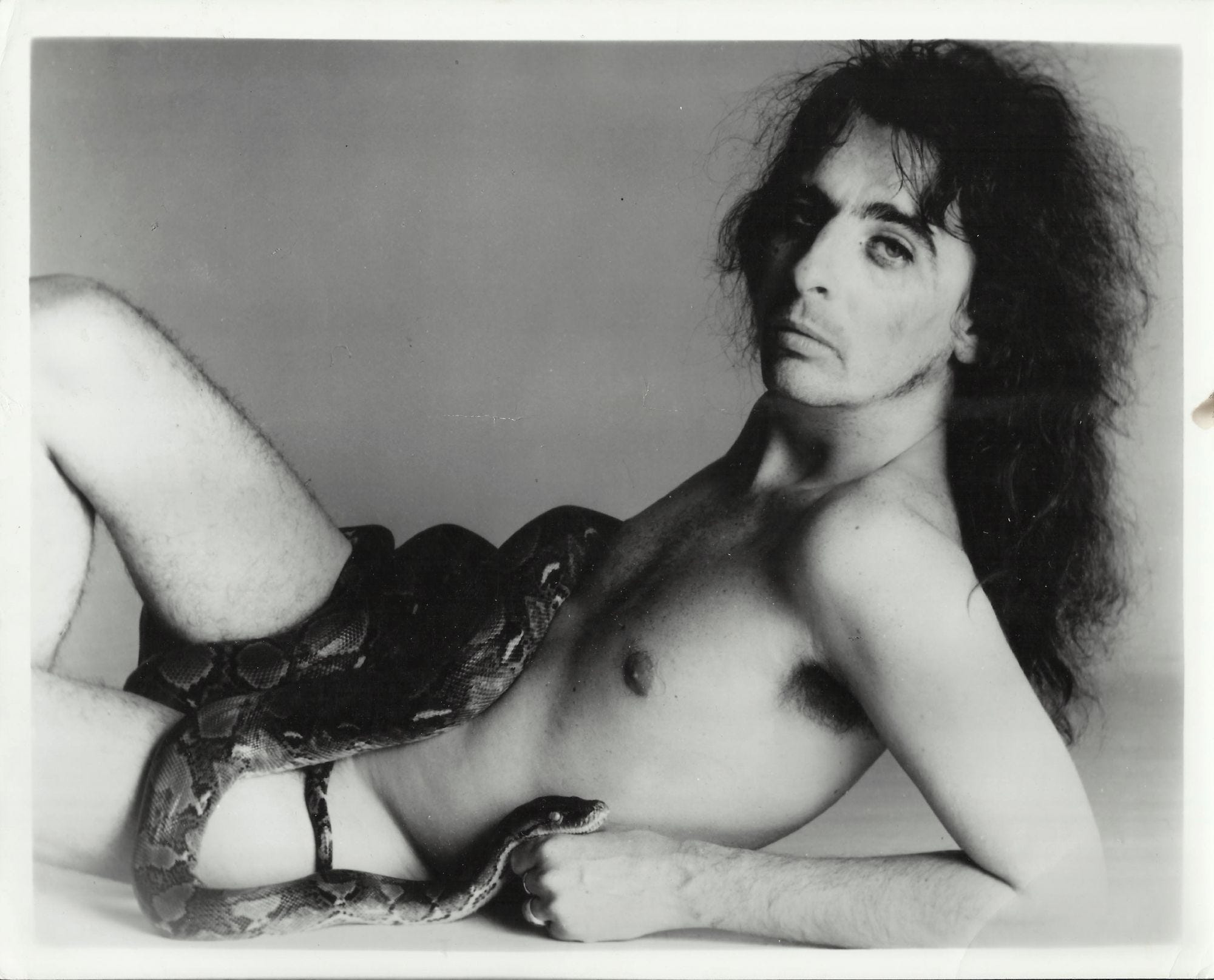
It’s 1972, two days before Alice Cooper’s first big headline show in the UK, at Wembley. Of ten thousand tickets, only fifty had been sold. The band’s manager, the notorious “Supermensch” Shep Gordon, came up with a plan to salvage the show from disaster. Alice would be photographed, completely naked, except for a conveniently placed boa constrictor. The image, blown up, would be driven around central London on the side of a large truck. As legend goes, when the truck reached Piccadilly Circus, the truck suddenly and purposefully broke down. Traffic jams ensued, and tipped-off press came to cover the commotion. The next day, headlines urged England to “Ban Alice the Horror Rocker”, and put parents around the nation into a tailspin, all while the Wembley show of course immediately sold out. The people buying the tickets probably hadn’t even heard the music, but the message and the medium had immediately sold the promise of an experience.

Alice had already made headlines for allegedly biting the head off a chicken live on stage in Toronto in 1969, and his stage show would continue to be pure circus entertainment, often featuring snakes, guillotines, axes or electrocution. “Rocking, shocking, psycho-theatre” as they called it.
The stories abounded, Alice lived up to the myth, and the prophecy fulfilled itself: teenage rebels looking to piss off their parents went in their droves to see Alice’s thick slice of theatre for years to come. In later years, Alice’s snake would notoriously join him in his first class airline seat.

In his triumphant stunt, Shep had understood the power of an image and the ideas held therein. He knew that those ideas form our perception, and as he helped build Alice Cooper’s career, he built the cult of celebrity within these images. Simply put, he knew images have the power to make the music better.
I’ve always been interested in music’s larger-than-life characters like Alice, the inescapable and untameable personalities that simultaneously divide and unite. Some of my favourite artists are the most singular, most ridiculous and most fantastical acts: like Bjork, Aphex Twin, ODB, Kool Keith or MF Doom. It’s hard not to be seduced by the exaggerations, the unbelievable truths, and the compelling visual worlds that make fandom thrilling, and bring you into the mythos. It’s as close to modern day folklore as you can get.
I bring this up to speak about how deeply images affect our reading of an artist and their place in the world, and how fundamental image-making can be to the process of good artist development.
An Image-Making Process in Practice
It’s 2018, and Wembley is sold out once again. This time, it’s Popcaan’s first headline tour in the UK, in celebration of his sophomore album Forever. Yes, this is my tenuous link between Alice Cooper and Popcaan.
I want to run through the image-making process for Forever, that came out on the indie record label, Mixpak, which I ran for many years.
Mixpak was a boutique independent label, and like many people in the indie space, we often worked with artists who had non-traditional management set-ups. So, by virtue of just rolling our sleeves up and getting stuck in where it was needed, my role in an artist’s record might be quite fluid. More often than not, I’d be heavily involved in the creative.
In this particular case, I worked on both A&R and marketing for the album, which included overseeing all of the creative content. I oversaw what was made, who made it, and how it would be rolled out into the world. Over the course of the campaign, I assembled a team of creatives and collaborators, some I already knew and some I had never worked with before, some Jamaican, some American.
Most of the time, the strategy and creative will be made by a different set of people. But, by doing both, it afforded us being really able to understand every corner of the release. (Sorry to my KPI-heads but I won’t be talking about the totality of the marketing here, just the image process.) The joy of being an indie label is that you can create these quite boundless systems for artists, if they want it. You can be as uncompromising in the vision as you want, work with a strong notion of aesthetic quality, and on a timeline that makes sense for the project.
To give some context, it feels important to say that Dancehall is such a singles-heavy market, and albums can be overlooked as being culturally important. This is especially true within the context of the US music industry that has historically cared little for Caribbean records, despite their long-standing impact on pop and underground music worldwide.
Popcaan *wanted* to make albums, to put his mark on the world with considered projects that would showcase his range and artistry.
We had already put out his debut Where We Come From a few years prior, which I had also worked on and put into the pantheon of great covers featuring prayer hands:

A second album is a notoriously hard endeavour - you’ve had critical acclaim, you’ve become famous, your life has changed, and then you’re hit with a barrage of expectations for a follow-up. It was fundamental to come with something that nipped any of this in the bud - the world we built around it had to feel as classic as the music.
Design is often about problem-solving, and it’s no different in the world of the artist. If your design isn’t serving the art or the artist, then it’s not serving its purpose, even if it looks good. Form follows function. So, the visual language needed to feel like a continuum - a coherent world in harmony with the music, the ideas put forward, and what Popcaan represented.
The story was about leaning into this idea of dancehall and classic albums, and putting Popcaan front and centre as a singular artist in his genre. The record is honest and heartfelt: there are stories of liberation, there are wining anthems, there are battlecries, there’s gravity and there’s upliftment. It beautifully houses a lot of juxtapositions.
The iconography had to stand up to the idea of a classic, by playing into both tradition and a sense of the new. It needed to speak to Jamaica, present and future, and it needed to have a have holistic feeling that would stand the test of time.
[I’m going to speak about “we” going forward, and that’s going to mean a mixture of everyone from the artist, artist team, creative collaborators.]
Our reference points for the single art started with street promotion for Jamaican dances. Across Jamaica, you’ll find street dances, businesses or anything really, advertised with decal stickers on the back of cars, buses and taxis. Often it’s just to add character to someone’s car. It’s a vibrant tradition that had never been spoken to on cover art, to our knowledge.

We found a decal printer in Kingston, and printed up the names of each of the singles we had picked at that moment, despite not having quite all the tracks finished. I spent a day driving around Kingston and the hills just on the outskirts of the city, looking for cars that looked right for the shoot, with a photographer and fixer. Every car we found, we got lucky that the owner was fired up to have their car used, (and wanted to keep the decal on after). One car we found was abandoned, which is why you can see a gas canister on the seat inside.
We mostly ended up using 35mm shots of the cars, and then those were turned into individual cover art by the album’s art director, Phil Annand of Madbury Club fame. I had always loved his sensibility for colour, textwork, bricolage, and his acute attention to detail.
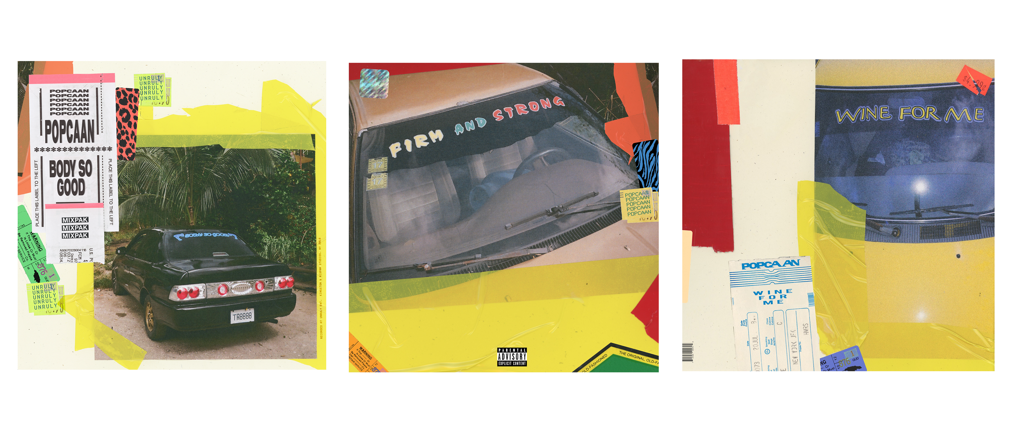
The running theme and visual language here drew from Phil’s signature “packaging” style at that time - pricing stickers, airline graphics, bold colours, and lots of little details to buy into. Phil’s work embodies both class and playfulness, which is without doubt a difficult balance to strike, but one that felt key to working with Popcaan.
The single covers were built to feel like standalones in a series. We also printed car decals for advertising the album, and we let loose a few in both Kingston and Toronto.

The first wave of singles and the album announcement came with new press shots, shot by photographer Ivar Wigan. I had also just commissioned Ivar to make a video for Vybz Kartel’s “Real Bad Gal”, and so we were concurrently working on both projects in Kingston. I loved Ivar’s raw style, his understanding of Jamaica (he’d lived there for some time), his love for dancehall, and his ability to capture something that felt both vulnerable and stylish all at once. The press shots were done with a very stripped back set-up, some colour filters, a smoke machine and some paint.
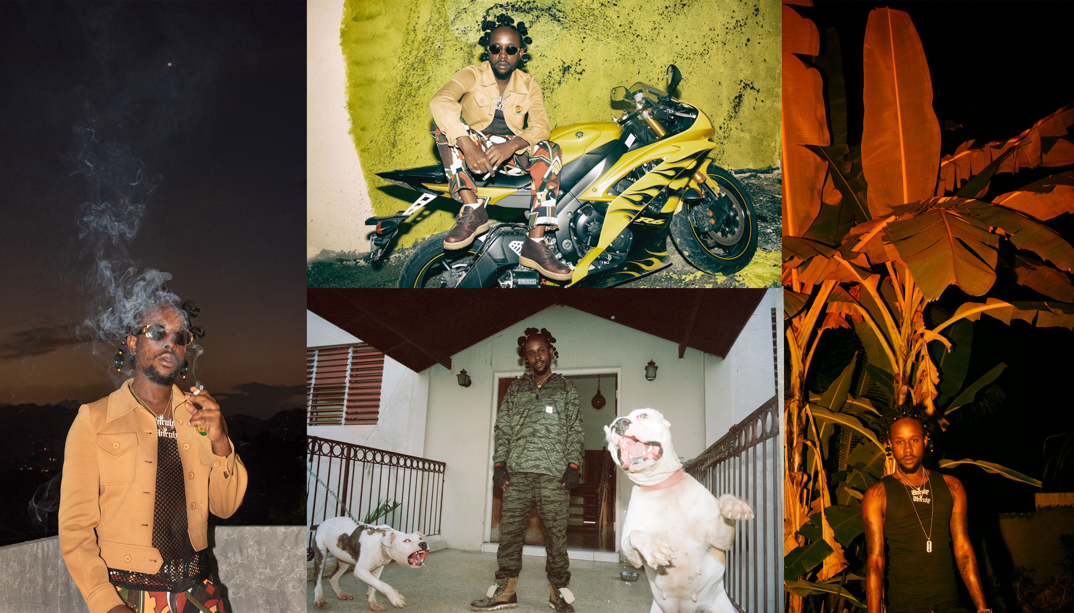
The lead image ended up tattooed on a fan. And also on promotional out-of-home posters that had the stickers from the single artwork on, as a tie-in.


We thought we had got the album cover shoot done at this time as well, but after numerous iterations, it wasn’t right. We were dangerously close to the release date, and had to start all over again with the cover art. We re-shot the photos while Popcaan was travelling to Toronto, in a studio. As always, Popcaan had his hair done in an iconic way, and he ended up choosing this shot.
We took the sticker motif from the singles art and used it here. These are my initial mock-ups, and where we ended up.

These static visuals (single art, press shots and album art) formed the basis of the campaign, and from there, we built out a huge web of visuals: big out-of-house advertisements, tiny online banners, IG video ads, lyric videos, etc. The sheer amount of things that go into an album release is insanity (and it’s only gotten worse since 2018). It’s a logistical quagmire that leaves you knee-deep in spreadsheets.
The photos below are some of the places it was translated to. We still wanted these parts to feel really intentional in their design, recognizable as part of a whole, but not just carbon copies of each other. There’s a lot of tweaking you have to do for different images, for instance in the London underground, text cannot in any way resemble graffiti, so we weren’t able to use the handwritten parts. This is just a fraction of all the images that were made.

.
And here’s some cold hard evidence of the marketing in action. Make their heads turn!

The first video, “Wine For Me”, was shot by Willo Perron and Imogene Strauss. Willo is a master of quality control, and I knew both their discerning tastes and deep understanding of artists would bring something special.
“Wine For Me” is an ambitious, one-shot video. Yay, no editing! Oh sh*t, they have to get everything right in one take! They brought in some top notch projection mappers from Russia that made everything look very simple, despite it being a really technically advanced video. If you really watch it from start to finish, you’ll see how it all unfolds.

We shot a second video with Willo and Imogene in Jamaica, for “Silence”, which was deliberately a verité style video that gave a more intimate portrait of Popcaan’s life and spoke directly to the audience. The goal was to portray both the darkness and the light of the track, and was partially shot on Mini DV (by Sandy Kim), to bring an almost surveillance-style feeling. Contrasted with the high def of the digital camera, you get both grit and gloss, which is really the essence behind the song: the pitfalls of being at the top. The final car decal we made (“Forever”) is an easter egg in the video, where you can see exec producer Dre Skull sitting in the car.

Our third video was for “Dun Rich”, featuring Nigerian artist Davido, shot by Meji Alabi in Lagos. Essentially, this is a love song, and it was important to show that side of Popcaan here. We go through beautiful shots of Nigerian cityscapes, stylized choreo, bike stunts, colourful gele, and of course some shaku shaku. It’s a series of vignettes of Nigerian life that feel real and empowering. It was shot on a mix of 16mm and digital, which gave it a soft, warm texture, and leaves you with a sense of nostalgia and emotion. Sidenote, this is the only afrobeats track that I know of that mentions Bitcoin.

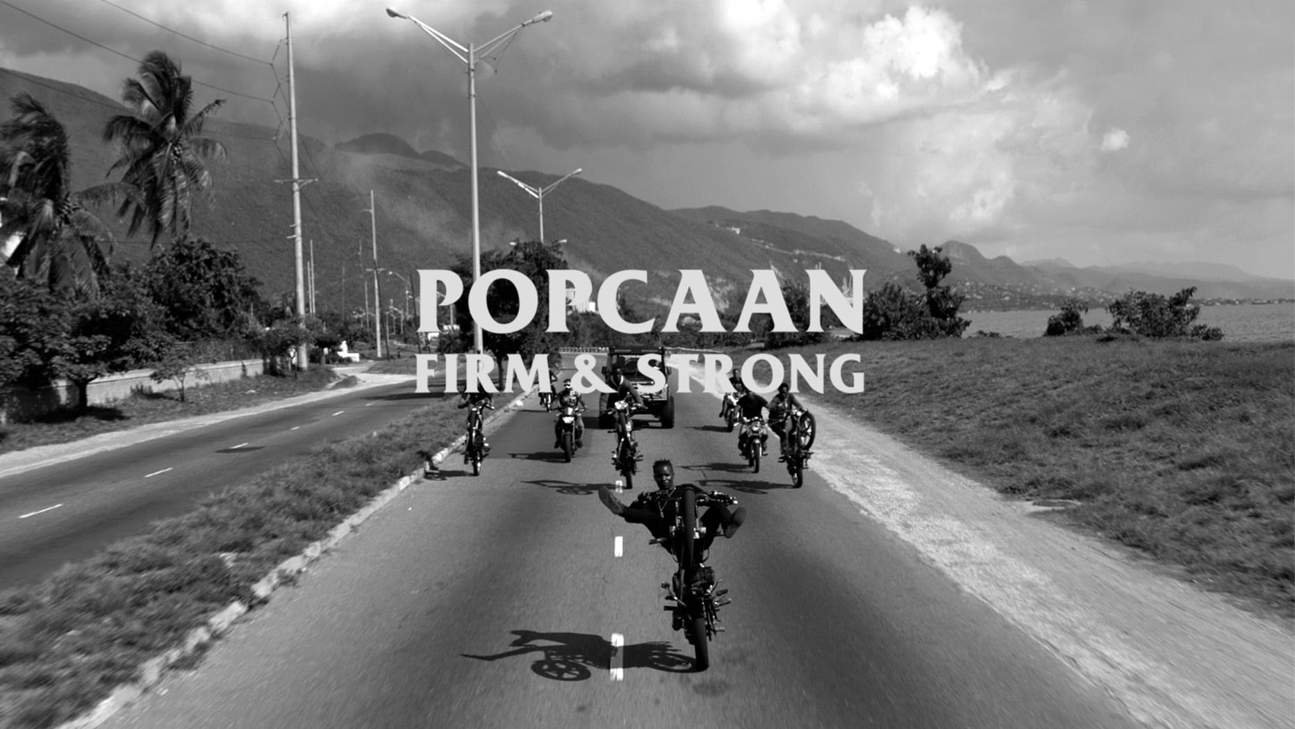
“Firm & Strong” was our fourth video, shot in Jamaica by Nabil. This is one of the most beloved tracks on the record, it’s been a tonic in hard times for many. Years on, the YouTube comments still read like a grief support group:

There’s a gravity to this song that needed to be translated to the video. It was achieved by the black and white, the dramatic drone shots, the sound design and the overall narrative sense of desperation and reassurance that you can feel coming through the screen at you. Nabil captured the solemnity of the track perfectly.
The video reaches its climax at a hilltop church nestled in amongst the Blue Mountains, with a full choir leading Popcaan to deliverance. The choir performed the song in real life — they are not lip-syncing — which helped the emotional weight of nine people singing in unison feel felt. I watched both this choir and the original choir record in the studio, and can safely say it’s a physically moving experience to bear witness to.
Our final video, “Body So Good”, was released about a year after the initial record. This video was as close to a Fitzcarraldo level shooting disaster as I’ve gotten - plagued by visa issues, scheduling problems and drama - but thankfully director Tom Gould persevered. He took influence from the quintessential reference of Belly, and created a club scene that felt true to dancehall, but also had elements of the surreal. We cast British model Leomie Anderson as his co-star. If I could for one moment tie it back to Alice Cooper - here are the on-set snakes arriving for their day at work.

.
Since we had some really strong iconography in the visuals, it felt pretty seamless to translate to merch and physical packaging. We made some basic album shirts to give away at the launch party / Boiler Room we did in Kingston, and then a full run of nice quality long and short sleeves, a special tie dye shirt, a sweatshirt, two hats and a patch, all made in the USA. I think the Law & Order logo re-do was probably a step too weird, but I stand by it.

I love making merch, but when someone mentions vinyl manufacturing, my eyes immediately roll up into the back of my head. But there’s nothing we love more than the crackle of a warm 180g vinyl is there? So we’ll push on through. We managed to get the vinyl out within a few months of the record release, which in 2023 is both unheard of and prohibitively expensive. We chose a premium quality white vinyl, with a special insert and booklet that featured all the credits and unseen photographs from Ivar Wigan’s photo shoot that I mentioned earlier. If 50% of people who buy vinyl aren’t even going to listen to it, you might as well make it look as sexy as you possibly can. The vinyl release is where the design feels at its most consolidated. A digital cover leaves you with such little room for manoeuvre, but the vinyl allows you to really go in on the detail - from the weight of the paper to the colour of the vinyl. This feels like a showcase of the totality of the design of the campaign. It allows you to touch and feel quality. When your music exists in space, give it the weight it deserves.

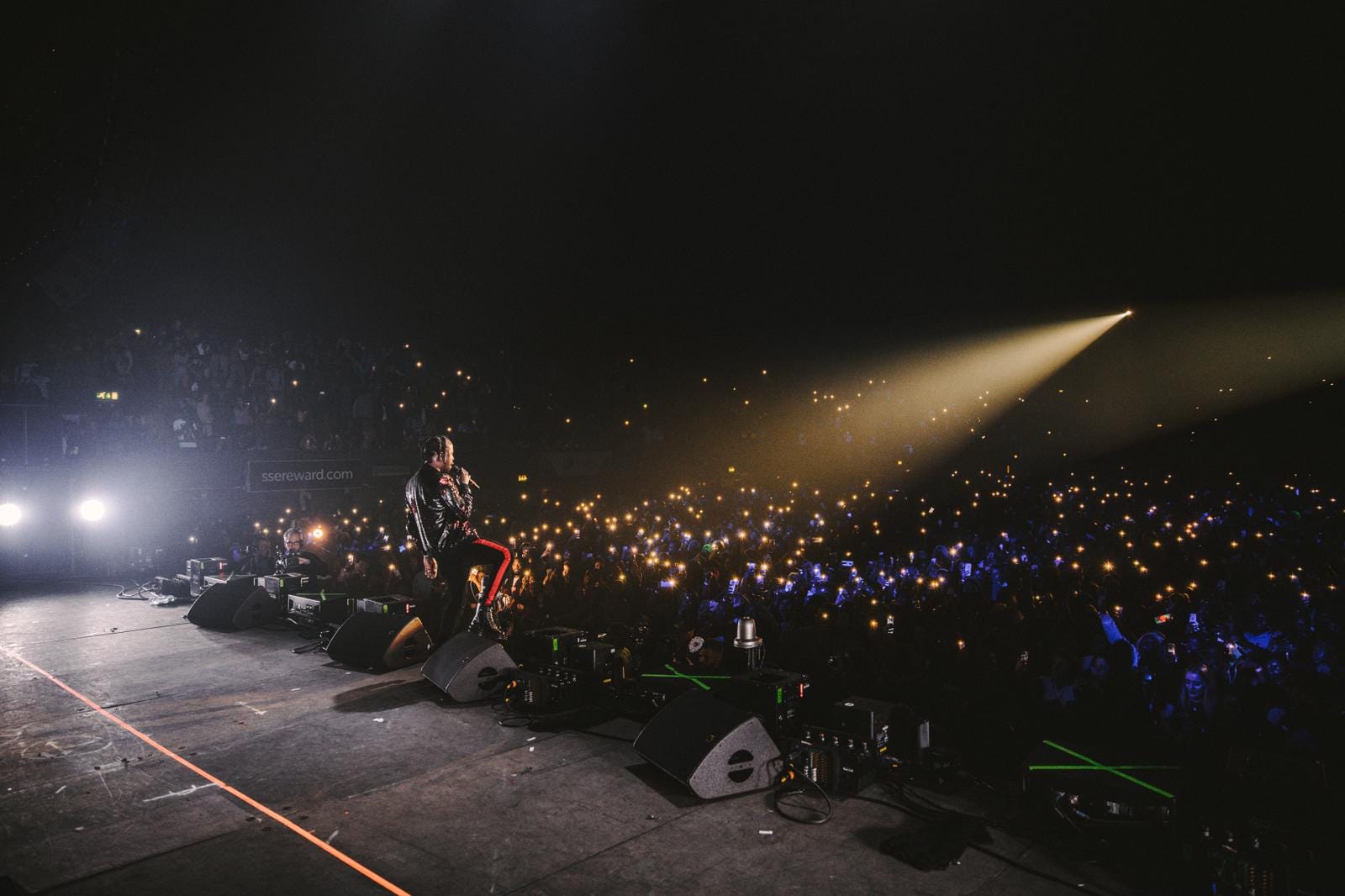
The Forever tour landed around the same time as the vinyl- a sold-out tour across UK arenas, which was the first time that Popcaan had sold out venues of that capacity. The live visuals consisted of a series of screens set up geometrically around his live band members, and used textural elements from the campaign as well as b-roll from the videos shot in Jamaica. There was pyro as well, of course.
This was the culmination of the campaign, and it was a joy to be in Wembley Arena that night. As the chorus lifts a room of twelve thousand people in unison, it’s hard not be moved, and to remember that music is about communion, human connection and creating memories. Please enjoy this little snippet of “Everything Nice” below from the night.
Shout out the man, the myth, the legend, Popcaan + everyone who worked on this record.
Photos of the campaign courtesy of Mixpak Records.

Thanks for reading this first, LONG post. For each edition, I will be sharing music from the harder to spot corners.
Here are some things I’ve been enjoying lately:
This cassette label, Sudan Tapes Archive, whose mission is to “preserve the sonic imprint of Sudan”. The artwork!
This mixtape from UK act Jim Legaxcy from earlier this year. The music is as collaged as the cover art and the influences run very deep. He has to be one of the most exciting new acts out of the UK at the moment.
This (old) video of Jeff Mills playing the 909.
This Indian electronic music from as far back as 1969, which is truly mind-blowing. The tapes even said “Electronic Dance Music”.
Iconic London label Night Slugs celebrated their 15 year anniversary this year and they released a fantastic remix compilation in honour.
The extremely wholesome and enjoyable Wham! documentary on Netflix. We miss you George!
You can also find my monthly radio show on NTS here.
Get in touch! suze@suzewebb.com
Thanks for sharing your insights on this popcaan album campaign! I always thought about this album as a a great reference for it's images and visual vocabulary (as well as musicaly of course), so I'm definetly happy and thankfull to read the story behind it. looking forward for what's coming up next. Bless.